Advertisements are supposed to be full of impact without being too overpowering. David Ogilvy, The modern Father of Advertising, said that, “A good advertisement is one which sells the product without drawing attention to itself.” Subliminal Advertisements are the best way to send your message to the audience without being too obvious. Following are some best subliminal ads of all time:
Pepsi vs. Coca-Cola Halloween Ad
Pepsi released the image on the left and Coca-Cola responded with the image on the right. Pepsi’s original ad is subliminal: it shows that getting a Coke when you wanted a Pepsi is scary. Coca-Cola’s response to Pepsi’s ad is perfect and teaches us a lesson that sometimes the tagline really does make the image.

Milwaukee Brewers
The Milwaukee Brewers logo from 1978 to 1993 is an iconic example of a subliminal logo. Composed of an M and B to make a catcher’s mitt.

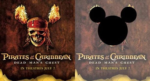
Pirates of the Caribbean
Disney’s Pirates of the Caribbean bridges the gap between family-friendly and adult action movie. The logo has exactly same spaces and gaps just like Mickey Mouse’s logo.

Amazon
Amazon’s logo has an arrow which starts from Amazon’s A and ends at Z which shows that amazon a sells everything from A to Z.

FedEx
The white space in the logo clearly shows an arrow which is an indication of the company’s speed and ability to get your delivery from Point A to Point B.

